Components (69)
Multi Select
A multi-select component that lets you select multiple items from a list.
Radio Card Group
A set of radio buttons with a card styling.
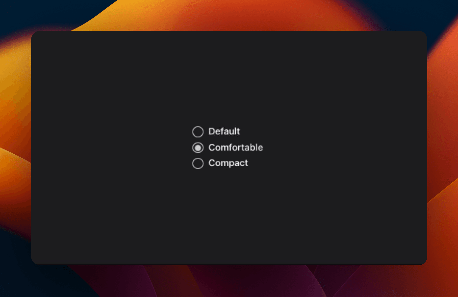
Radio Group
A set of checkable buttons—known as radio buttons—where no more than one of the buttons can be checked at a time.
Select Country
Displays a list of countries (or regions) for the user to pick from—triggered by a button.

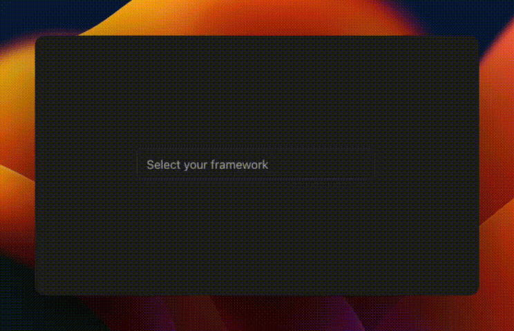
Select
Displays a list of options for the user to pick from—triggered by a button.
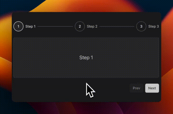
Stepper
A stepper to indicate the user's progress through a multi-step process or form.

Switch
A control that allows the user to toggle between checked and not checked.
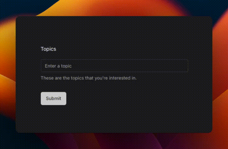
Tags Input*
An input that allows the user to enter tags.
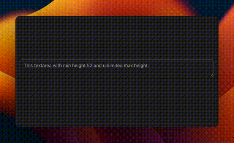
Text Area
Displays a form textarea or a component that looks like a textarea.
Time Picker*
A time picker that allows the user to select a time.

Alert Dialog
A modal dialog that interrupts the user with important content and expects a response.
Dialog Stack
Extends the Dialog component to display content that complements the main content of the screen.
Dialog Extended
Displays a responsive dialog, built on top of vaul Drawer.
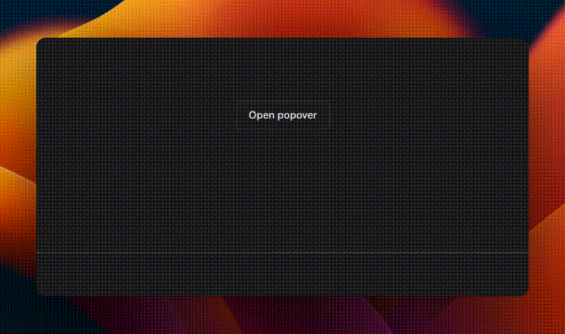
Popover
Displays rich content in a portal, triggered by a button.
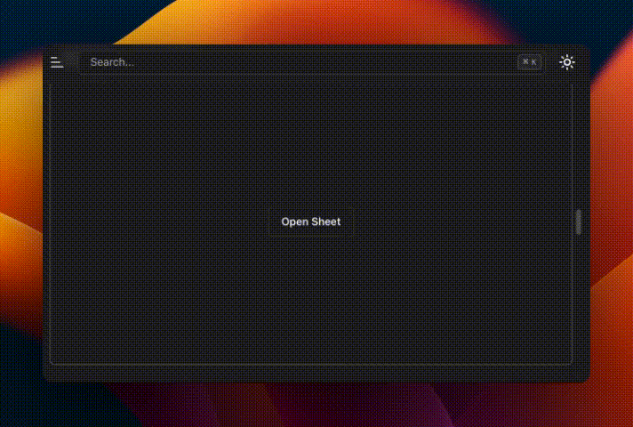
Sheet
Extends the Dialog component to display content that complements the main content of the screen.