Core Components
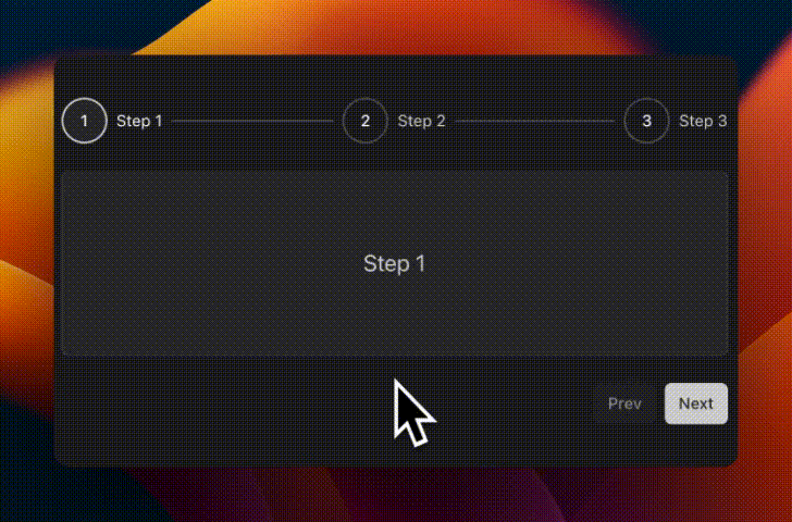
Stepper
A stepper to indicate the user's progress through a multi-step process or form.

Switch
A control that allows the user to toggle between checked and not checked.

Tags Input*
An input that allows the user to enter tags.
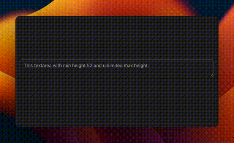
Text Area
Displays a form textarea or a component that looks like a textarea.

Time Picker*
A time picker that allows the user to select a time.
Accordion Extended
A vertically stacked set of interactive headings that each reveal a section of content.

Accordion
A vertically stacked set of interactive headings that each reveal a section of content.

Breadcrumb
Displays the path to the current resource using a hierarchy of links.

Command
Fast, composable, unstyled command menu for React.